#THROWBACK THURSDAY
THURSDAY, 26 FEBRUARY, 2015

SPACER
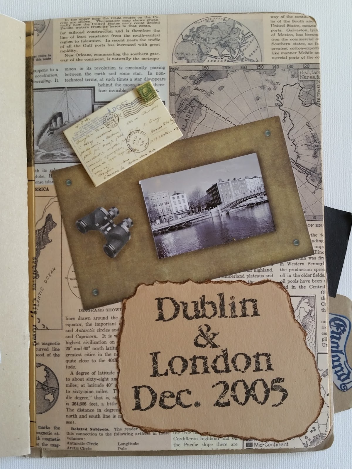
For today's Throwback Thursday I am actually sharing a mini file folder album I did years ago, 2005 to be exact, rather than a layout.

I had genuinely forgotten that I had created this album. I was going through some old stuff, doing a clear-out to get rid of some product I have never used and came across this little treasure.


I created this album for a friend who visited me here in London in 2005 just shortly after I moved here. We had been out of touch for a few years due to various house moves on both parts so I was pleasantly surprised when she got in touch to say that she was travelling to Ireland and also to England.
 
SPACER 

She was a bit meticulous and very methodical in her planning for her trip so I jokingly created this mock itinerary on the inside of the album as she was a chronic list maker. I ran the lined paper through my printer and as well a Post-it Note for the "Note to Self". I have to say she saw the funny side of it and she got a kick out of it!

Please note this post is very photo heavy so be forewarned before you start scrolling down! 
SPACER
SPACER
The inspiration for this album was actually from someone I followed on Two Peas in a Bucket.  She had created something similar for a trip she had taken around Europe. I absolutely adored the album and asked her loads of question about how she created it. 
SPACER
SPACER
Apparently it had been a kit that she had purchased which I was disappointed to learn. And why was I disappointed you may ask? Well, I am still somewhat of a budget savvy scrapper nowadays but back then I was even more of a scrimpy budget scrapper. I didn't like spending money on things that I thought I could make myself and it also probably didn't help that my husband (at the time) didn't really understand my hobby or why I would want to spend ALL THIS MONEY on just paper. 
SPACER
SPACER
So I scrutinized all the photos of the album she had created online and thought to myself, I can make this! I can do this! It may not look the same as hers but I could definitely create a good copy. I took some heavy 12x12 craft cardstock and folded it in half, creasing it with my bonefolder and then created another fold about half an inch from the edge of this on the front and back cover of the album to allow the folder to open.
SPACER
SPACER
I was going to hold it all together with some large gold brads but knew that I would need some way to hide the brads on the front of the cover so I used a ragged torn strip from a brown paper bag down the spine of the album. I also thought this would give it a great oldy-woldy feel in tune with the theme of the album.
SPACER
SPACER
Then I just cut the page inserts from regular cardstock and created the file folder tab on the back cover of the album by tracing around a tab on a manila file folder.
SPACER
SPACER
I covered some of the pages with patterned paper (more than likely K&Co and Chatterbox) and left some of them blank.  Most of my embellishments would have been K&Co from their travel line called Journey (very old). I used a lot of Dymo tape,do love my Dymo label maker! Even now!
SPACER
SPACER
The titles were done with simple brown cardstock which I then tore into strips once I printed the titles on them and then inked around the edge with brown ink. 
SPACER
SPACER
They definitely made the rounds with all the sites. Not missing a thing!  I used a mixture of colour, black & white and sepia photos to again give it that old vintage feel. 
SPACER
SPACER
A day was spent with us at Windsor Castle and also at The Crooked Tea Shop in Windsor, definitely a must see for all visiting tourists! 
SPACER
SPACER
This was around the time that the book The Other Boleyn Girl came out so they were a bit obsessed with Henry the VIII which made Windsor Castle a must on the itinerary list. 
SPACER
SPACER
I really enjoyed making this album and was quite pleased with how it turned out in the end. 
SPACER
SPACER
SPACER
SPACER
SPACER
SPACER
Back of the album - added a few vintage style luggage labels as well as some travel stamps. 
SPACER
SPACER
I hope you are enjoying my #Throwback Thursday series as much as I am enjoying revisiting my old scrap projects. 

As always, thanks for taking the time to drop by my blog.

FEBRUARY PROJECT LIFE PART 2
TUESDAY, 24 FEBRUARY, 2015


Hello Crafters!

Today I am sharing part 2 of my Project Life for February. This post is up through Valentine's Day.

SPACER
SPACER
This first page includes my February title card. I would like to get monthly dividers for my album but I'm not keen on the BH ones so not sure what else is out there OR alternatively, if I could make my own and what I would use to do so.

In my last post here, I talked about my title card and how I got the inspiration from Michelle Wooderson. Below is a close up of a filler card I created for the top right pocket as I needed something to go here. 

SPACER
SPACER
The background card is PL (Kraft) and then I punched out a circle of white card after I printed "Don't forget" on it. I added a small gold star from Studio Calico.
SPACER
SPACER
I know I already did a layout with one of my snow pics but I wanted to also include these other shots in my day to day PL. I added some really old rub-ons by Deja Views in a winter theme to the photos. 

In my last post I was finishing up Thirteen Reasons Why.
SPACER
SPACER
Since then I have started another YA book called Slammed by Colleen Hoover, which I have whizzed through! I simply took a photo of the book cover and then mounted it on black cardstock, adding the hashtag #currently reading. 
SPACER
Well, with this next layout I will now be found out, that I am a Walking Dead fan.  Yes, I admit it, I have always been a zombie lover. Ooooh, reading that back that sounds a bit creepy and weird. What I mean is I have always been a zombie film fan, even though they scare the living crap out of me, all the way back to the original black and white George Romero days of "Night of the Living Dead".
SPACER
SPACER
I have so desperately been waiting for The Walking Dead to come back on after its mid season break. Honestly I've been counting down the days until it returned. As I am meant to be documenting the day to day and this is kind of a big deal in my week I thought it only seemed right to include in my PL. I document about movies we see, so why not this?! As it airs one day after it airs in the US I have to make sure to stay offline from Sunday night to Monday night to make sure I don't accidentally see any spoilers. Nuts I know!
SPACER
SPACER
As I really enjoyed the episode with Daryl and Beth, the relationship that developed between them, plus with them both being two of my favorite characters, I just had to include the pic below especially with the way the mid season finale ended. It was heart wrenching. 
SPACER
SPACER
The full page (The insert has 2 6x6 pockets)
SPACER
SPACER
In the top pocket I used yellow paper by Simple Stories as my background paper. I wanted the title to be the opposite of the words in the photo above it. The alphas are AC Thickers by Amy Tangerine. I added my journalling to the photo with white text. 

The back side of the 6x6 insert page. This photo of Simon makes me laugh so much. I met Simon at the front door one day when he came home from work and it looked he had been given a really bad spray tan, hence the title "fake tan?". I jokingly asked if he was planning a holiday to Marbs, popular here in the UK as is the fake tanning. Sometimes so much so that people go orange in colour, which is exactly what he looked like. It was actually just brick dust as he had been on the grinder all day. So funny. He was nice enough to let me get a picture.
SPAC

The background paper is Teresa Collins. The white alphas are Kaisercraft with both the stickers in the upper left hand corner by Simple Stories.  The pseudo blue polka dot washi tape is actually a strip of paper cut off the top of a PL Kraft journal card as is the grid paper I typed the journalling onto.

I have yet to fill the top 6x6 pocket in this insert. I will have to use it for something later in the month.

The next page that I am sharing is my Valentines Day layout. My title card below I created with supplies from a kit by My Minds Eye called Lost and Found. Everything is My Minds Eye except the letters spelling out Valentines which are by Bella Blvd. 
SPACER
SPACER
We had planned this night to go out to the cinema and then for a meal.  We weren't too fussed really as we are not ones to make a big deal out of Valentines Day. We thought we'd have a casual evening - go see American Sniper and grab a burger at Five Guys. We were surprised to find out that American Sniper was sold out, which was a genuine surprise as we imagined that with it being debut weekend for 50 Shades that everyone would be going to see that. So our movie plans were a bust and then much to our dismay, Five Guys was shut. So all in all, not what we had loosely planned. We ultimately ended up at The Handmade Burger Company, which was just as good. 
SPACER

My Valentines Day page


I included a couple pictures of the restaurant and then added a few fillers cards from the same kit by My Minds Eye, Lost and Found.  I also included the little brochure about the restaurant that they have on the table in the utensils bucket and also the little tag they have on the wooden stand where you put your table number after ordering at the bar. I thought the tag would make a nice addition to my album. 
SPACER
I have added a 6x8 pocket page to include our Valentine cards in the album.
This is the card that I made for Simon also with the Valentine's Day kit called Lost & Found by My Minds Eye. I am not much of a cardmaker but I had fun with this card. 
SPACER
SPACER
Here's a photo of the back of the insert with the card Simon gave me in it. 
SPACER
SPACER
On the back of the page I included a 6x8 photo of my burger - a New York Deli Burger! Pastrami is so commonplace in the US but not something that is so common here in the UK. I always delight in the opportunities when I find it here. 
SPACER
SPACER
The back of my Valentines Day page in its entirety. A photo of Simon looking so serious, which he always does, plus a photo of both of us and a photo of me in my red Valentines outfit. I have yet to complete my journalling on the 4x6 card but I will do so later. 
SPACER

That's my February PL part 2 done!

Hope you enjoyed it and thanks for taking the time to stop by my blog.


#THROWBACK THURSDAY
THURSDAY, 19 FEBRUARY, 2015


Hello Fellow Crafters!

Today I am carrying on from the series I started last week using the popular social media hashtag, #Throwback Thursday and showcasing some of my older layouts here. 

This layout is going back to January 2005 and is called "All Torn Up".

SPACER
It documents a habit that my old Jack Russell Terrier named Flash used to have, which was tearing paper, any kind of paper - toilet paper, paper towels, newspaper or receipts off the coffee table to shreds, virtually teeny tiny shreds.  Sometimes I wonder if he had OCD. He never used to chew things up, with the exception of when he was a puppy, but give him a bit of paper and he would go to town on it! He would stand on it with one paw and then begin tearing off small pieces, until there was nothing left of it. 
SPACER
SPACER
This goes back to the time when paint chip cards were quite popular in scrapbooking. Who would have ever thought that something that you could pick up at your local hardware store or building supply store to determine what color scheme you wanted to paint your living room and bedroom would be become popular in scrapbooking?! 

I'm sure there were plenty of Home Depot sales associates at the time who were quite confused when trying to help various female customers who may have been perusing or lurking in the paint aisles to have them politely decline their assistance but then pause to see them grab handfuls of paint chip cards, and not just one or two colours but virtually every colour of the rainbow!  The cards were obviously free but yet I expect I wasn't the only who felt a slight bit "wrong" (for lack of a better word) when trying to casually slip more than 5 or 6 cards into my bag. As if I was doing something illegal. Quite comical if you think about it now.
SPACER
SPACER
We were in the process of getting things together for an estate sale so we had lots of boxes out in the hallway. We were trying to keep them for packing when we moved. For a few days Flash had his eye on this particular Black and Decker box that the leaf blower had come in. He had already stolen it a couple times before this but we always managed to get it away from him before he had done any real damage.  However, on this day, we just thought, let him have his fun and let him keep it once he managed to run down the hall with it. We laughed ourselves silly just watching him tear it to shreds. 

As you can see I used a paint chip card here in my layout. I wanted this layout to mimic the colours of the Black and Decker box that Flash tore up that day, I also wanted the page to look torn but then thought how would I keep it together if I actually tore the paper apart. So I mounted the orange paper on black cardstock to give it a torn effect.
SPACER
SPACER
This was also a time when industrial style supplies - metal mesh, cardboard, washers, things of that nature were a bit popular or on trend with scrapbooking. As it was a box that Flash had torn up I thought it would be a great effect to use cardboard or something like it for the title as well as the journalling. So what I did was find a large piece of cardboard, tear off the top layer of paper so the corrugated bits showed and then made a colour copy of it onto thin white scrapbook paper, like the kind that used to come in the page protectors in post bound albums. I then ran it through my printer for the title and journalling, scrunched it up before mounting it on heavier cardstock to give it weight, then adhered it to the page and placed different sized foam dots underneath it to give it varying height. I think it gave the effect of real cardboard quite well. 
SPACER
SPACER
Here's a photo of the entire layout. I thought the large Black and White photo at the top of the page, of him standing on the cardboard, tearing it up would be a nice contrast with the background paper and as well with the color photo strip at the bottom of the page. 


Thanks for dropping by my blog to check out my "#Throwback Thursday" series. 

I hope you enjoyed the old school layout!

And P.S. - I know paint chip cards aren't really still trendy in scrapbooking, but I do enjoy using them on occasion, even with my current scrapping!

FEBRUARY PL PART 1
WEDNESDAY, 18 FEBRUARY, 2015


Today I am only sharing one page in my Project Life for February. I know this may seem odd but for those of you that may not have visited my blog before I document my PL in a monthly fashion, or as things happen rather than in a weekly fashion. 
SPACER
SPACER
For my title card I have taken inspiration from Michelle Wooderson, who is phenomenal with her Project Life and basically anything she crafts and creates! If you would like to check out her blog, you can find it here. To see the title card I took inspiration from you can find that here

I have fallen behind a bit, not necessarily in the documenting but more so in the "getting the pictures taken and up on the blog" process. Mainly because as anyone in the UK knows there is not a lot of natural light here at this time of year to take photos, good photos that is of your layouts unless it is in the middle of the day, when the sun is out for about an hour or so.  So if you are otherwise preoccupied midday, then it can be difficult to get your photos taken. 

I thought it best to get this layout up on the blog and then if I can manage to get the other page up by the end of the week it will be a bonus. If I didn't put up either, than I would just be even further behind in blogging. Plus, one of my goals this year is to be more consistent with my blog posting, in all honestly it should have been up yesterday. So better to have one page up than nothing at all!

Here is the page that I am sharing today:
SPACER
This page documents one event, Afternoon Tea with a friend of mine. It is quite a traditional British thing to do here in the UK and I have to say I enjoy it very much! 
SPACER
SPACER
Here is my title card for this page. This colour scheme, pastels, is not something that I would normally use in my layouts, I typically go a bit brighter so it was enjoyable to try something new and step outside of the creative box, so to speak. I took inspiration from the colour palette used on the "tape" on the scone card. The background card is by Echo Park with the alphas being a mixture of Lilybee, Simple Stories and Kaisercraft. The banner tag is from an SC kit, the pink star Freckled Fawn and the pink February tag an old PL card I cut up. 
SPACER
SPACER
I did have a lot of fun with this layout as one, I am trying to use up a lot of my bits and scraps and two, I am also trying to do a stash buster this year as I have accumulated so many supplies over the years that I just need to use up already. It was fun trying to find all the tiny pieces I could use. The background paper is K&CO and the pink sticker with Heart This is Simple Stories DIY.
SPACER
SPACER
All of the food was simply heavenly! Everything fresh and handmade. It was definitely a yummy treat. Handmade scones! I used an old PL card for this pocket. I cut along the pseudo washi tape on the top of the card and inserted the picture just underneath it. I then printed out the scrummy scones banner on Bazzill cardstock, added a "can you believe it" sticker from the DIY line by Simple Stories and added a yellow enamel dot also by Simple Stories. 
SPACER
SPACER
These meringues with the fresh fruit were simply to die for! Let me tell you I was absolutely stuffed by the time I walked out of the hotel reception. The card is an old PL card scrap and the pink chipboard star is by SC which I thought nicely mimicked the strawberry on the meringue quite well. 
SPACER
SPACER
This is a picture of the Grand Reception Room where we had our tea at the hotel.  I adhered the photo to a bit of gold vellum and then added a gold label by SC, after running it through my printer.  
SPACER
SPACER
And finally the last pocket, a picture of me all dressed up for afternoon tea!  The round gray sticker is from the DIY line by Simple Stories as is the enamel dot and the purple Love tag is a random tag I've had for a while, it may be American Crafts. 

Thanks as always for taking the time to stop by my blog!

Hope you're all progressing along nicely with your 2015 Project Life!

Any comments are Welcome!

THROWBACK THURSDAY
THURSDAY, 12 FEBRUARY, 2015


Hello Fellow Crafters!

Things like MCM (Man Crush Monday), WCW (Woman Crush Wednesday) and TBT (Throwback Thursday) are extremely popular on places like Instagram, Facebook and other social media platforms. 

So I thought I would start what I'm hoping is a fun series here on my blog and use Throwback Thursday in another way, to showcase some of my old layouts. For a good giggle and also to see the difference in my scrapbooking style and hopefully see how far I have come. Possibly see how trends have changed or maybe how some have stayed the same. 


So for my first "Throwback Thursday" layout I am going back to 2003 - gosh, 12 years ago! Also to the days of post bound albums! These layouts document when I moved from L.A. to Arizona. 

SPACER
SPACER
This was back when paper tearing and chalking were all the rage. As I didn't keep track of what supplies I used back then I would fathom a guess about the supplies used here. For the page above I do believe the map travel paper would have have been by K&Co, which came in a kit.  As for the embellishments, these would have been vintage ephemera by Paper Pizazz which I purchased at a large craft store in Arizona which I cannot recall the name of - Craftworld or something like that. As for the road signs, these would have been pictures we took along our route from L.A. to Arizona. Yes, even then I was pulling over on the side of the road to take photographs for my albums. Once a die hard always a die hard! 
SPACER
SPACER
Remember when Mrs.Goodman's stickers were popular (I'm sure I'm dating myself here!) and in great abundance, before a lot of current day brands probably even existed. These were those realistic photograph style landscape stickers. I have to admit I used my fair share of these back in the day. This page was simple - Bazzill cardstock, landscape sticker and then an AAA roadmap torn up to provide a backing for the journalling which I have blurred out for privacy.   
SPACER
SPACER
A close up of some of the hand stitching I did on the map to make it look like it had been sewn together after I tore it apart for the layout. You can see some good old tearing on the cardstock there with heavily chalked edges. I sort of wanted this page to have a bit of the old west feel to it. 
SPACER
SPACER
This was also around the time that the industrial or sort of grunge look, distressing your pages was popular.  Using things like keys, metal or clock parts, or the like on your layouts. As well, another popular trend at the time was distressing or aging your pictures, which I have to say is an application I still enjoy doing to this day. If you look closely you can see I took a bit of sandpaper to distress around the edges of the picture above.  
SPACER
SPACER
Close up of the details on the page
SPACER
SPACER
Ahh, "die cuts", done the old fashioned way. Painstakingly with alpha templates and a tiny pair of scissors! I love how I wanted to emphasize the numbers in the address by creating this die cut. 

I hope you enjoy this series as much as I am enjoying looking through my old albums and as always, thanks for taking the time to drop by my blog.